BeyondMD
Industry
Healthcare
year
2025
Platform
Wordpress (Elementor)
Role
Lead UX/UI Designer & Web Developer, Leverage Marketing
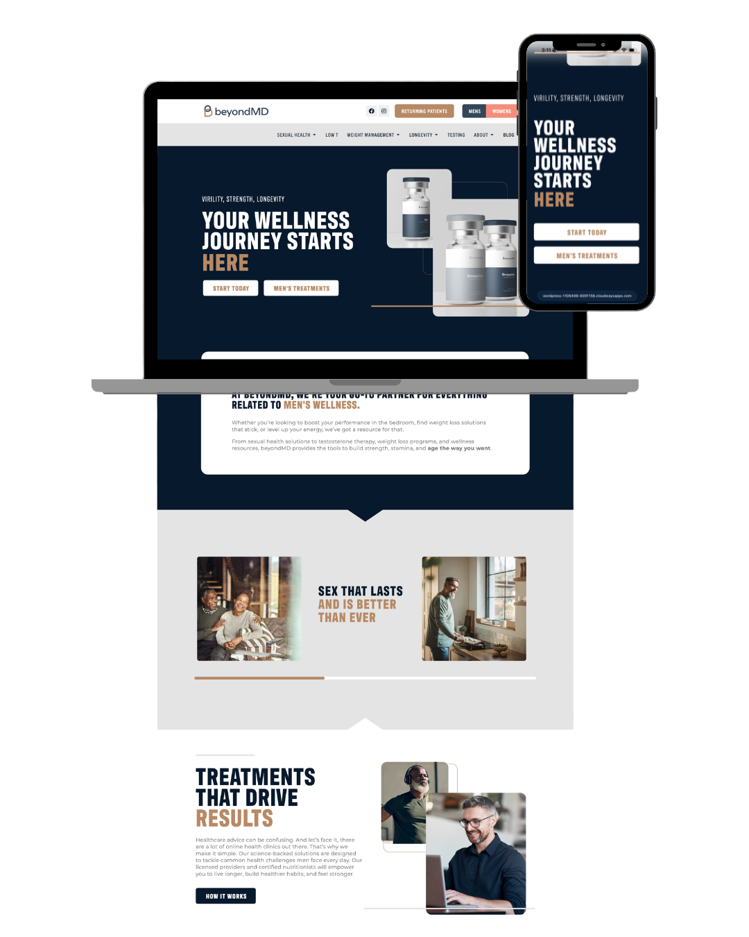
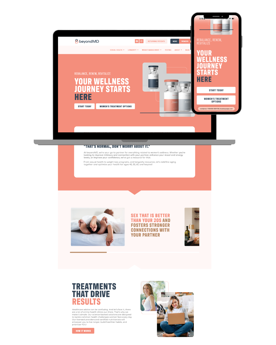
BeyondMD is a healthcare practice focused on patient-centered care and accessible medical services. The goal of this redesign was to simplify the patient journey, clarify service offerings, and create a structured pathway for both new and returning patients. The project prioritized IA and intake flow optimization to reduce friction and improve appointment conversion.
BeyondMD is a healthcare practice focused on patient-centered care and accessible medical services. The goal of this redesign was to simplify the patient journey, clarify service offerings, and create a structured pathway for both new and returning patients. The project prioritized IA and intake flow optimization to reduce friction and improve appointment conversion.

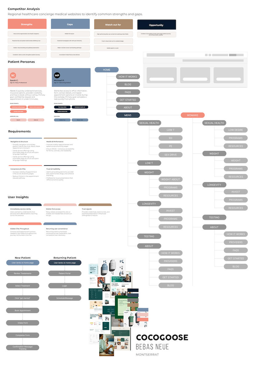
• Navigation lacked clear separation between new and returning patients
• Service information was dense and difficult to scan
• Appointment booking lacked hierarchy and visibility
• Patient portal access was not clearly emphasized
• Rebuilt the sitemap around two primary user types: new patients and returning patients
• Created a structured intake flow from service selection to booking confirmation
• Introduced clearer CTA hierarchy across all pages
• Elevated Patient Portal access within the global navigation
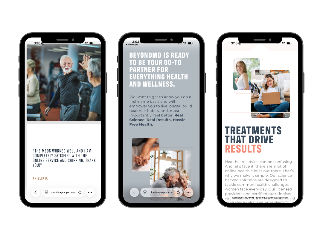
• Simplified service interior pages using modular content blocks
Before designing the experience, I spoke with internal staff to understand how patients were navigating the intake process and where confusion was happening. Analytics data (GA4) also showed high drop-offs during multi step form. These insights informed a simplified form structure and a clearer visual hierarchy to guide the users through the process.
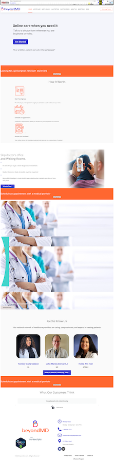
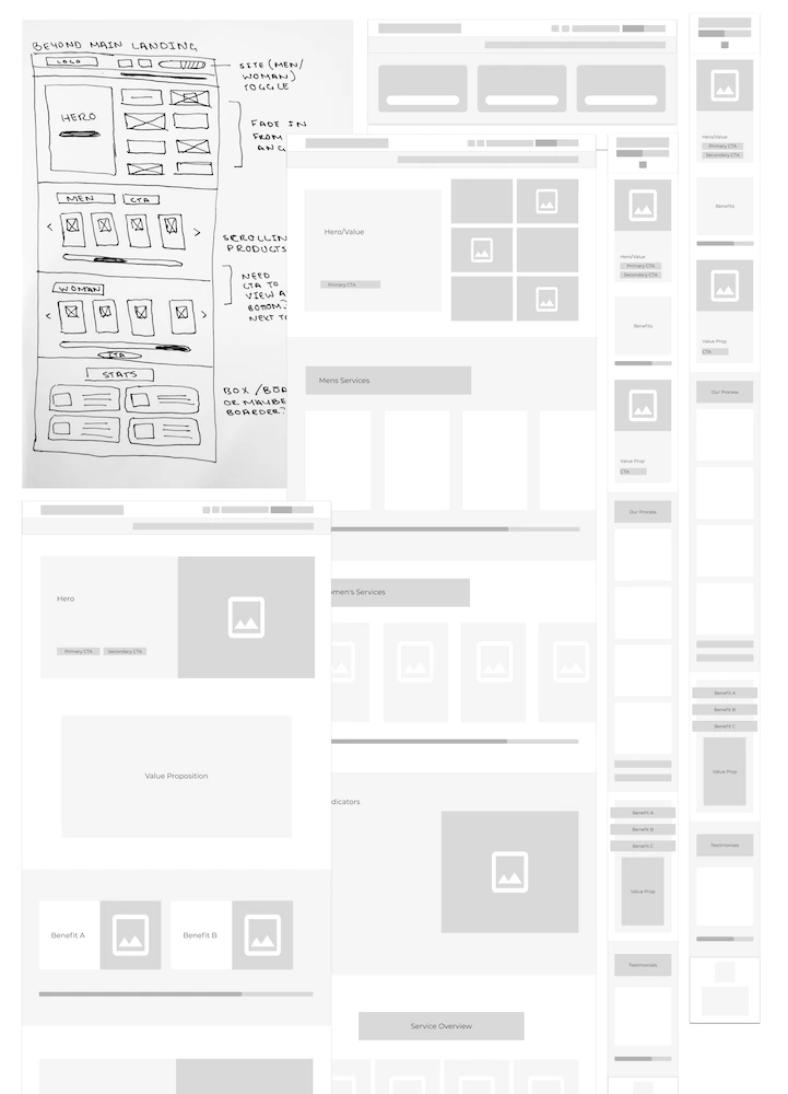
Before jumping into visual design, the sitemaps and user journey flows were mapped to ensure a streamlined intake experience. Wireframes focused on hierarchy and conversion placement. The homepage was structured around value proposition → services overview → trust indicators → primary booking CTA. Service interior pages emphasized clarity and simplicity.
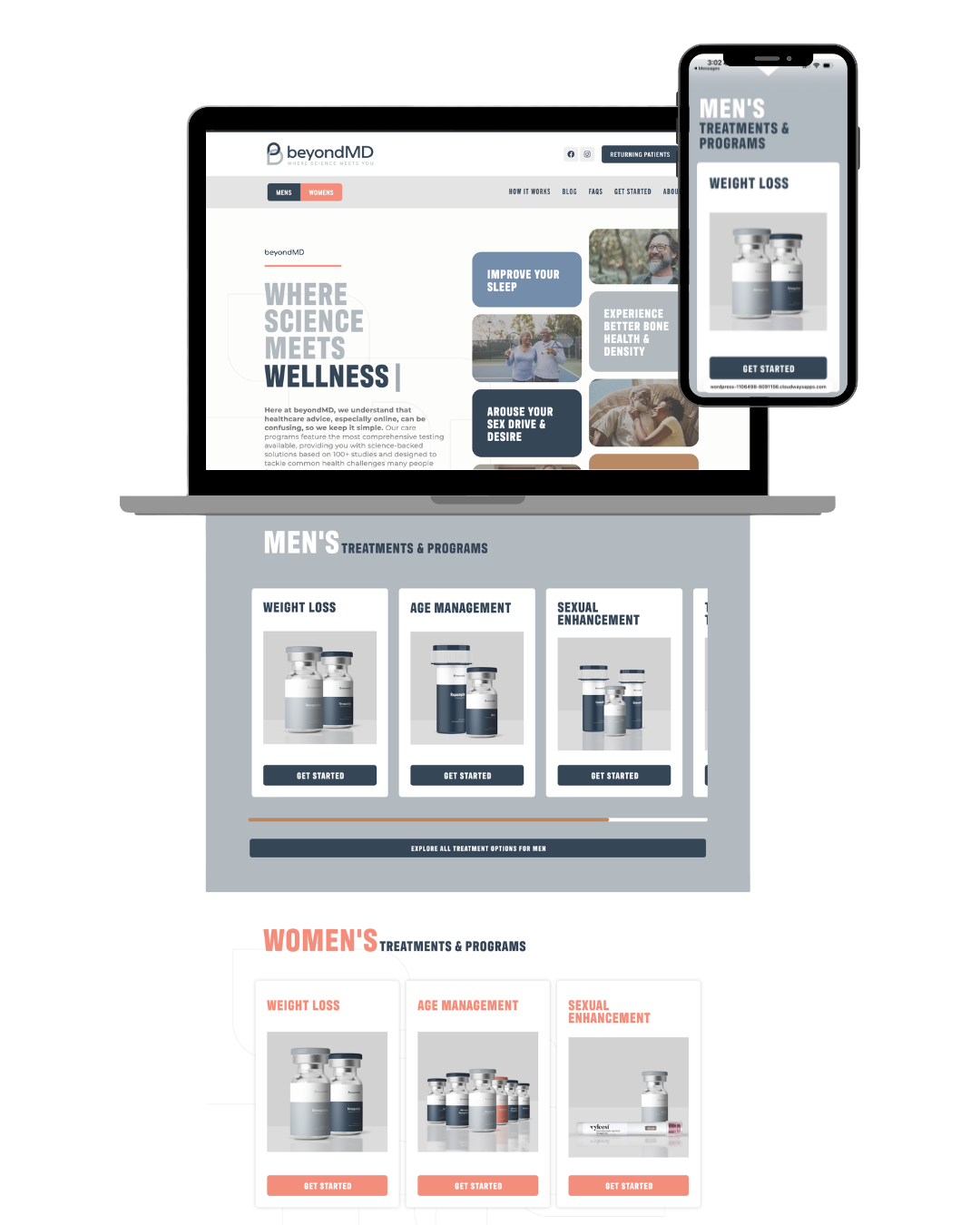
The final design presents a clean, structured healthcare experience that prioritizes clarity and trust. Navigation is simplified, appointment booking is emphasized, and returning patient access is clearly integrated into the global structure.
• Healthcare UX requires clear pathway separation between user types
• Strong CTA hierarchy significantly improves perceived clarity
• Mapping patient intake flows early reduces structural revisions later