Arc of the Lakeshore
Industry
Non-Profit
year
2025
Platform
Wordpress (Elementor)
Role
Lead UX/UI Designer & Web Developer, Leverage Marketing
Arc Lakeshore supports individuals with developmental disabilities and their families. The goal of this redesign was to clarify navigation for multiple user groups, families, donors, and volunteers, while improving accessibility and information hierarchy. The focus was on simplifying pathways to services and increasing donation conversion clarity.
Arc Lakeshore supports individuals with developmental disabilities and their families. The goal of this redesign was to clarify navigation for multiple user groups, families, donors, and volunteers, while improving accessibility and information hierarchy. The focus was on simplifying pathways to services and increasing donation conversion clarity.

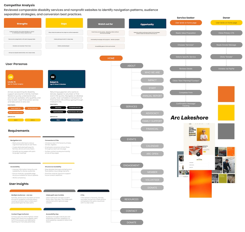
• Navigation was overly complex
• Multiple audiences shared one information structure
• Calls-to-action lacked hierarchy
• Service pages lacked clear intake pathway
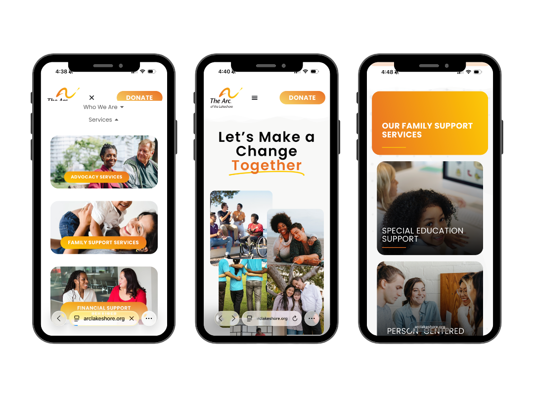
• Reorganized sitemap to reduce cognitive load
• Created dedicated pathways for primary user types
• Introduced clearer CTA hierarchy
• Simplified service detail pages
• Emphasized conversion driven flows (intake, donate, register)
The website structure was rebuilt around primary user journeys. Detailed sitemaps and behavioral flows were mapped before visual design began, ensuring clarity between service seekers, donors, and returning users. Wireframes prioritized hierarchy, modular layouts, and conversion placement.
Over the following year, the site generated 6,100+ page views from 3,300 unique users, nearly doubling the traffic volume compared to the equivalent pre-launch period. The expanded site structure successfully surfaced previously buried content: dedicated pages for Advocacy Services, Family Support Services, Financial Support Services, and the Donate flow all appeared in top-10 traffic for the first time, indicating that the reorganized IA was routing users to the right destinations.
The contact page remained a consistently high-traffic destination (635 post-launch views vs 345 before), reflecting continued demand for connection, a pattern that informed the decision to surface contact access more prominently across all service pages.

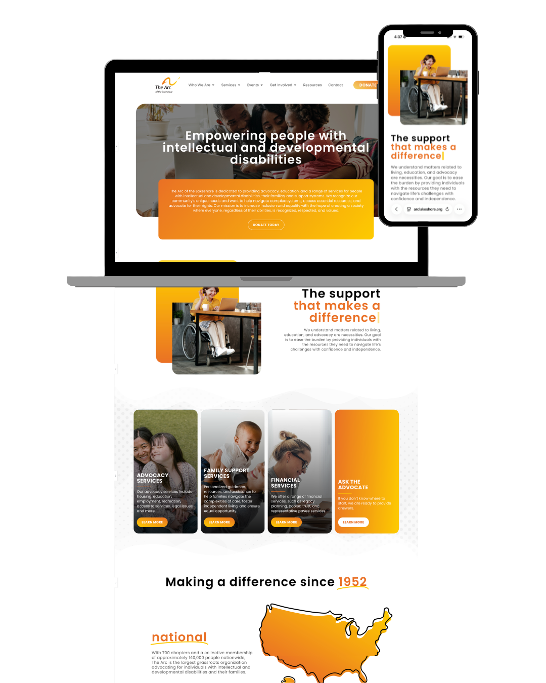
The final design delivers a clearer information structure, streamlined navigation, and improved call-to-action visibility. The system is modular, accessible, and scalable for future growth.
• Multi-audience navigation requires clear pathway separation
• Early flow mapping reduces layout revisions later
• Visual hierarchy must reflect behavioral priorities